Thoughts/ suggestions

Chinchilla & Hedgehog Pet Forum

Help Support Chinchilla & Hedgehog Pet Forum:

This site may earn a commission from merchant affiliate links, including eBay, Amazon, and others.

Riven

Bad Chin
Joined
Jan 29, 2009
Messages
3,584
Location
Central Nebraska
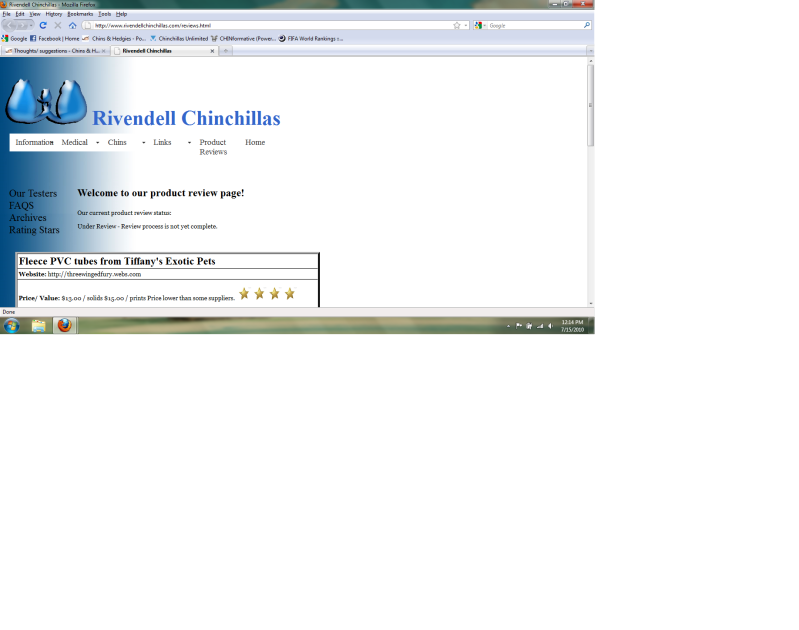
I'd like to get some thoughts suggestions for the Product Review layout page.

http://www.rivendellchinchillas.com/reviews.html

Are there other things you would like to see?
Is there suggestions on layout or other things that might make it easier to view?

The photos and such are not loaded yet, this is the beta version to test with.

Please let me know what you think. Thanks!
 
for me, that's not very "nice" to read. I think the box would be better in the center and the colors and such need changed so that it's more appealing to the eye. Just my opinion though and I tend to be a bit OCD...if something isn't "right" I can't look at it for long without feeling like puking, lol.
 
if you put it more towards the middle, maybe you could spread out the boxes so you dont have to scroll down to read everything, cause right now the font is quite large. the more people can read in one screen viewing the better.
 
the 2nd link didnt look much if any differnt.

i think my monitor is 22 inches. when i look at it, i have to scroll to read below the "uniqueness of product" section. all the content is on the left half of the screen and the whole right side of my screen is blank white space.
 
this is what I'm seeing

Rivenpage.png


I think it should be more centered and it needs color on the right side of the screen. All the white is hurting my eyes...even a light grey would be better. Like the blue and then the open space being a light grey (not even sure if that's do-able)?

The second version IS a bit better. The huge font, I think, was throwing me off a lot.
 
I think you should shorten it up, only give stars for the overall product. Then go in to detail without the stars. I had to scroll to read about one product and I think by the time you have more products it will look like too much reading.

Also I just noticed that when I tried to go to a link on your information tab it keeps going to the tabs on that page (our testers, faqs, etc.). Maybe it is just my page font is large, but it is frustrating.
 
Last edited:
Hmmm with size I run into the problem that if I go much bigger people with lower res. have it run off the page... If anyone knows how to fix that... I'd be glad to hear.

I will correct the link "see through" issue, I do know how to fix that.

Each product will have it's own page, so people can click to chose which item they want to look at.

Hmmm What if I made another column for the stars and made them smaller and off to the side? That would widen it, but shorten the length...
 
I think the "home" tab should be the first tab...and I also think everything is too much on the left and that it is too white. Maybe you should use a more appealing font? I also agree with Bethany about the starring method. ^_^
 
Okay, I'm trying something totally different over the whole site. It's not all converted, but the product review section is as an example. Is this overall a better look? Easier to read? More difficult? The same?

If there is a recommended font that's easier to read let me know, I kind of went with a basic, otherwise I get pretty crazy and no one can read it! LOL

Thanks guys for your help!
 
Last edited:
Missed edit time but I also combined site comments and site location, as well as payment and shipping options together to reduce over all space. Whaddya think?
 
Super. I might mess with that tomorrow and see how that lay out would work. If this style seems easier, I'll change the rest of the fonts over to that. Half the site is gone right now because it's black text, lol.

Tab, could you post another screen shot of what it looks like to you now? What res are you running?
 
I think you should use Century Gothic. Which is the font I'm using right now. Just my opinion.:)
 
Last edited:
I'm totally open to opinions. I'll give that a run when I get a chance, right now... it's out to strip branches... nothing like processing chin wood in 97 degree heat and 60% humity... yeah.
 
Sorry, this is not exactly what you were asking, but I noticed on your Home page that the black text is not readable on the top left hand side. You might want to try a solid background color with opposing text color, or maybe a text color such as blue that will show up on a black or white/gray background.
 
I, too, prefer to see web pages centered instead of left or right justified. Most of today's newer monitors are going to be widescreen (mine is) and when I go to your site I get a little less than half of my screen with text and the whole other side is completely blank, which is just hard on the eyes. At least if you center it, the sides can still be blank but it will be broken up and much more appealing.

I'm running Windows 7 and Firefox 3.6
 

Attachments

  • Capture.jpg
    Capture.jpg
    96.9 KB · Views: 8
Here it is on mine, it is almost painful to read white on black text.

And your navigation bar is messed up.

The size of it is good, it just needs to be centered. Even though I have a large resolution set I rarely have my windows open wider than you see there.

If you don't want to center it making the border sizes uniform will make it more eye appealing. Making it so the background is solid will help too.
 

Attachments

  • screen-capture.jpg
    screen-capture.jpg
    47.8 KB · Views: 5
Man... websites are hard...


:p

I'll mess with it the next couple days. I'll see what I can do on centering, I'll be honest I don't know how to do that... On my monitor it's centered when I view it, I run a middle res on a 19" monitor. I will talk to Brady my web guy, and see what suggestions he might have.

Spoof, are you suggesting all black, maybe a dark gray or ? Give me some thoughts on what you think would be good. Everyone said the white was blinding... lol Thanks

ETA: Thanks everyone for suggestions and helping with this. Getting other opinions is valuable for getting this set up.
 
Last edited:
Make your charts uniform in size. If you go from the product review page to say, the medicine page, the charts are two different sizes and un-uniform.

I find the black-on-black text or white-on-white text also painful and hard to read.
 
Back
Top